Merging Art and Usability:
Role
UX/UI Designer | Information Architect | Interaction Designer | Branding
Year
2022
Applications
Adobe XD, Photoshop, Rotato, Gifski, Screenflick
Brief
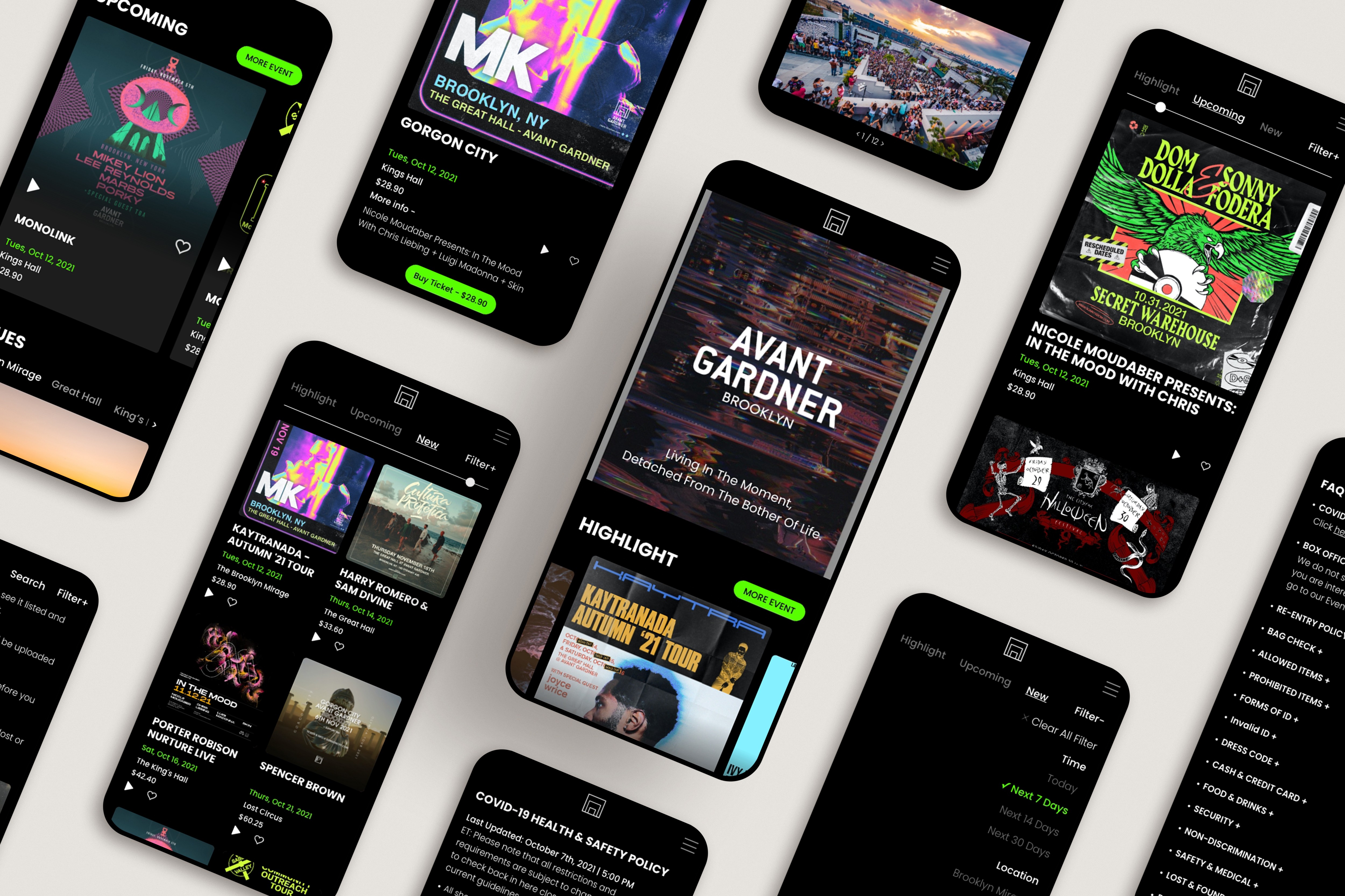
Avant Gardner is a well-known event space in Brooklyn, New York, famous for hosting large-scale music events, especially in the electronic music scene. My task was to redesign their website to better reflect the brand's identity, improve the user experience, and support the venue's business goals.
Overview
Avant Gardner is a premier event space in Brooklyn, known for hosting immersive electronic music experiences that draw crowds from around the world. From pulsating lights to dynamic soundscapes, the venue is a hub for music lovers seeking unforgettable nights. My goal was to redesign Avant Gardner’s website to better reflect its vibrant identity while improving the user experience, making it easier for both devoted regulars and curious newcomers to discover events and purchase tickets seamlessly.
Challenge
Despite its cultural significance, Avant Gardner’s existing website was holding it back. Visual clutter, unclear navigation, poor mobile responsiveness, and a lack of integrated payment options created barriers for users trying to find event details and complete purchases.
How might we translate Avant Gardner’s immersive, energetic atmosphere into a digital experience that feels intuitive and exciting, guiding users effortlessly from discovery to ticket purchase?
User Flow & Site Map
To transform the chaotic browsing experience into a seamless journey, I redesigned the user flow and site map to prioritize clarity and accessibility. The goal was to ensure users could quickly find events, explore details, and purchase tickets without unnecessary friction.
Key Actions:
Simplified the entry point with clear pathways from homepage → event discovery → event details → checkout.
Grouped essential information (date, location, price, artist details) to reduce clicks and cognitive load.
Designed mobile-first flows to accommodate users who often purchase tickets last-minute on their phones.
This structured approach created a predictable, intuitive navigation system that aligned with user mental models while maintaining the energy and aesthetic of Avant Gardner.


Brand Identity
One of the most pivotal aspects of this project was balancing the artistic and functional elements. Every visual element—color schemes, typography, and interactive animations—was chosen to evoke the atmosphere of the venue itself. The color palette mirrored the neon lights and shadows cast in the dark spaces of the club, while the typography felt bold and modern, reflecting the cutting-edge nature of the events hosted.
Design Approach
With a clear structure in place, the next step was to bring Avant Gardner’s energy online while ensuring a seamless user journey.


Usability Testing
To validate the solution, I conducted usability tests with five frequent event-goers, focusing on these key questions:
How intuitive is the site for users to navigate?
How quickly and easily can users find events and purchase tickets?
Participants were asked to complete key tasks, followed by a short questionnaire.
The questionnaire asked users to:
Indicate whether they completed the tasks (yes/no).
Rate the difficulty of each task.
Share their level of agreement with statements about the site’s usability.
Results
The results showed that most users found the navigation intuitive and completed tasks with ease. Key feedback included:
Improved Navigation: Users praised the clear event listings and intuitive filters, with 80% of participants rating the navigation experience as “very easy.”
Quick Checkout: The integration of Apple Pay significantly sped up the mobile ticket purchasing process, with participants completing the checkout in under 60 seconds.
I made final adjustments based on feedback, particularly improving the responsiveness of the event detail pages on mobile to enhance accessibility.
Future Enhancements
For future iterations, potential improvements include:
Personalized Event Recommendations based on user history.
Social Sharing Features to promote events and boost ticket sales.
Key Learning
This redesign taught me the importance of balancing brand aesthetics with user-centered functionality. Simplifying navigation highlighted that, often, less is more when guiding users to their goals. User testing was invaluable, reinforcing that a seamless digital experience can enhance both usability and emotional engagement, strengthening the connection between the brand and its audience.
Reflecting on the project, I recognized the value of envisioning outcomes that matter to clients, such as increased ticket conversions, reduced bounce rates, and enhanced customer satisfaction. This understanding deepened my appreciation for how thoughtful design choices can directly contribute to business success.
Related work


