Airtek Group
Transforming Technical complexity into Accessible UX

Airtek Group
Transforming Technical complexity into Accessible UX

Airtek Group
Transforming Technical complexity into Accessible UX

Role

Digital UX/UI Designer

Year

2024 - 2025

Applications

Figma, Google Analytics, Excel, Notion, Miro

Brief

Airtek Group, a leader in HVAC automation and energy management solutions, faced challenges with their digital platform's usability for engineers and facility managers. Our objective was to transform Airtek's digital presence into an intuitive, user-friendly platform that effectively communicates their offerings to a technical audience.

New Version

The Challenge: A System That Wasn't Working for Its Users

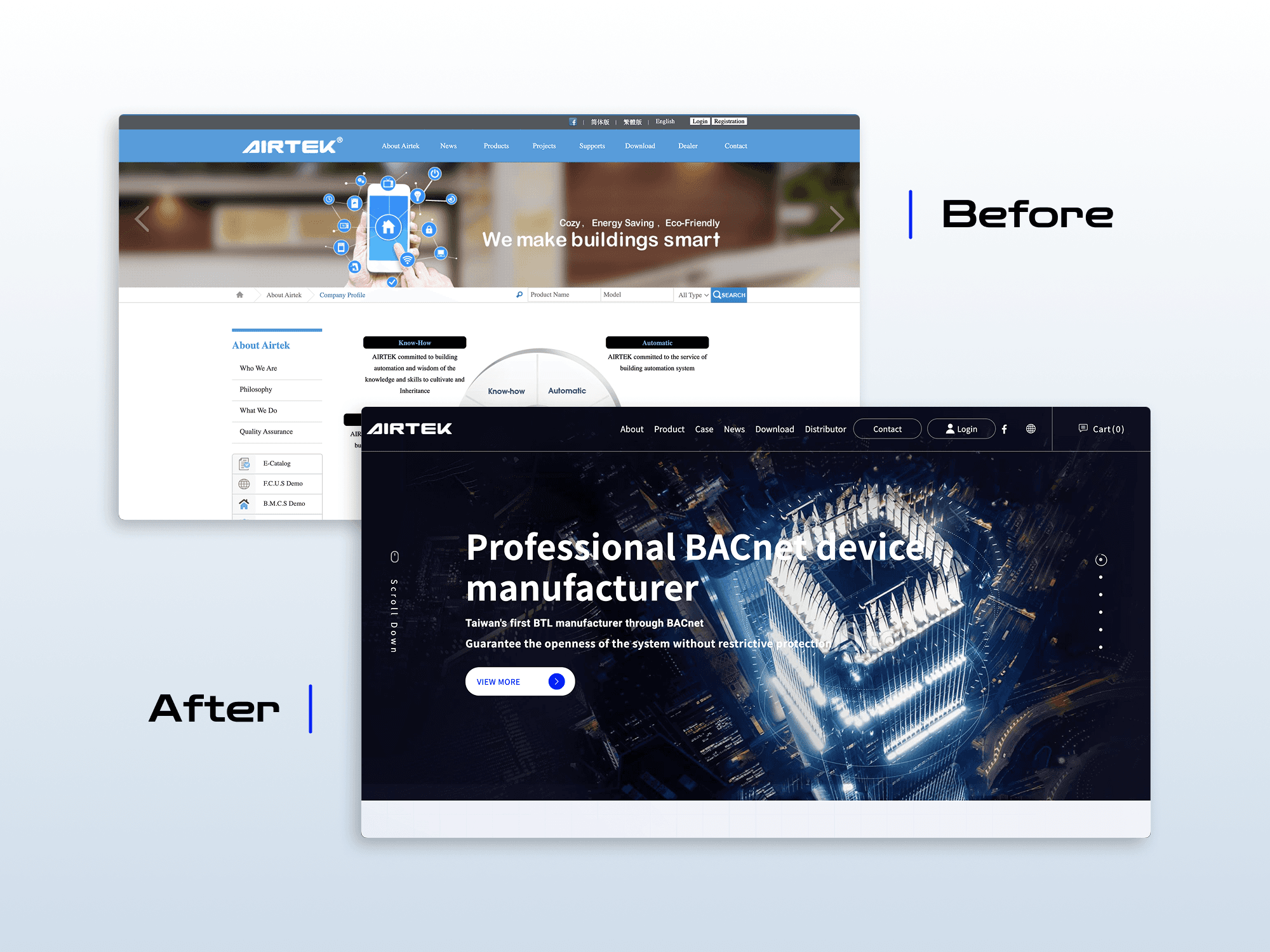
For engineers and facility managers, time is everything. Whether they’re troubleshooting systems or evaluating new solutions, they need quick, reliable access to technical specifications, product details, and manuals. But Airtek Group’s website—meant to serve as a gateway to their advanced HVAC and energy management solutions—was anything but efficient.


What should have been a seamless digital experience was instead a frustrating maze—scattered content, unclear navigation, and lost opportunities. Users were struggling to find what they needed, and Airtek was losing potential leads.


How might we streamline product discovery and technical access to better support engineers in high-stakes, time-sensitive environments?

Old Version
Simplified Navigation & Information Architecture

Understanding the Users: Uncovering the Pain Points

Before jumping into solutions, we had to understand how engineers and facility managers interacted with the site.


We conducted usability research with 40+ stakeholders, including engineers, facility managers, and internal sales teams, to map out the biggest pain points and opportunities for improvement.


Key Insights:

  • Complex site navigation made it difficult for engineers to locate product details and technical documentation under time pressure.

  • Unstructured and hard-to-find technical content lacked readability, slowing down evaluation and driving users to abandon the site.

  • An ineffective inquiry process and buried CTAs led to low engagement, limiting product requests and sales opportunities.

2. Improved Content Hierarchy & Readability:


  • Visual hierarchy enhancements made key specs easy to scan, digest, and evaluate quickly.

  • Interactive elements allowed users to compare product capabilities without endless scrolling.

  • Condensed technical descriptions ensured clarity without overwhelming the user.

3. Optimized Lead Generation & CTA Placement:


  • Redesigned the inquiry flow to reduce steps and make contacting sales seamless.

  • Placed clear, visible CTAs strategically in the main header and throughout key pages to drive engagement.

  • Simplified the inquiry form to minimize friction and boost completion rates.

Improved Content Hierarchy & Readability

Design Approach: A Redesign Built for Clarity and Efficiency

To transform Airtek’s website into a user-first experience, we focused on three critical areas:

To transform Airtek’s website into a user-first experience, we focused on three critical areas:


1. Simplified Navigation & Information Architecture:


  • A streamlined product hierarchy to help engineers quickly find relevant HVAC and energy solutions.

  • Easier access to technical documents through a dedicated "Download" section, reducing frustration.

  • User-tested labels and categories to eliminate confusion in product differentiation.

Improved Content Hierarchy & Readability
Optimized Lead Generation & CTA Placement
Simplified Navigation & Information Architecture

1. Simplified Navigation & Information Architecture:


  • A streamlined product hierarchy to help engineers quickly find relevant HVAC and energy solutions.

  • Easier access to technical documents through a dedicated "Download" section, reducing frustration.

  • User-tested labels and categories to eliminate confusion in product differentiation.

Improved Content Hierarchy & Readability

2. Improved Content Hierarchy & Readability:


  • Visual hierarchy enhancements made key specs easy to scan, digest, and evaluate quickly.

  • Interactive elements allowed users to compare product capabilities without endless scrolling.

  • Condensed technical descriptions ensured clarity without overwhelming the user.

Optimized Lead Generation & CTA Placement

3. Optimized Lead Generation & CTA Placement:


  • Redesigned the inquiry flow to reduce steps and make contacting sales seamless.

  • Placed clear, visible CTAs strategically in the main header and throughout key pages to drive engagement.

  • Simplified the inquiry form to minimize friction and boost completion rates.

The Impact: Turning Frustration into Actionable Results

By prioritizing clarity, usability, and ease of access throughout the redesign, we transformed a fragmented experience into an efficient, task-driven workflow that resonated with technical users.


  • +25% increase in average session duration, showing improved engagement and usability.

  • 3× increase in product downloads and technical document requests, driven by simplified technical data presentation

  • 20% boost in product inquiries within 3 months, proving the effectiveness of the new lead generation strategy.

  • Reduced bounce rate by 16%, confirming easier product discoverability.

Old Version
New Version

Reflection

Designing for Airtek challenged me to translate dense technical content into a user experience that felt clear, purposeful, and easy to navigate—without oversimplifying the information engineers rely on. It reinforced the importance of structured information architecture, role-specific workflows, and intentional content hierarchy, especially in B2B environments where time and accuracy are critical.


Beyond design execution, this project deepened my ability to work cross-functionally. I learned to navigate the needs of marketing, engineering, and sales teams while staying grounded in what users actually needed to get their job done. The most valuable outcome wasn’t just the metrics—it was hearing from stakeholders that the site now felt like a tool, not a barrier.

Case Carousels

2. Improved Content Hierarchy & Readability:


  • Visual hierarchy enhancements made key specs easy to scan, digest, and evaluate quickly.

  • Interactive elements allowed users to compare product capabilities without endless scrolling.

  • Condensed technical descriptions ensured clarity without overwhelming the user.

3. Optimized Lead Generation & CTA Placement:


  • Redesigned the inquiry flow to reduce steps and make contacting sales seamless.

  • Placed clear, visible CTAs strategically in the main header and throughout key pages to drive engagement.

  • Simplified the inquiry form to minimize friction and boost completion rates.

Related work

Check out other
cool projects which will
blow your mind

Check out other
cool projects which will
blow your mind

Check out other
cool projects which will
blow your mind